

 The Escort “Chapter One”
Project-Nerd Publishing
Creator, Writer, and Letterer: Iggy Michniacki
Pencils and Inks: J. C. Grande
Colors and Cover Art: Esteban Salinas
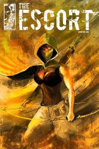
Meet Esme Ford. She lives in a post-apocalyptic world leading people from one destination to the next. This world—the former United States—has been torn apart by war and disease. The plot is interesting and drew me in. I almost got a Mad Max vibe from the story—with Esme traveling across a barren wasteland fighting against all odds to help others (but mainly to survive). I love a story with a strong female lead, and from the comic summary and cover, I was immediately intrigued. However, unfortunately, this first issue (a follow-up to Barrens, Project-Nerd Publishing’s previous comic featuring Esme Ford) is disappointing.
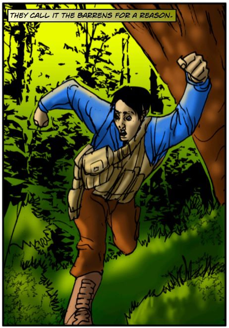 The artwork turned me off immediately. Having jewel-tone colors in both the foreground and background is too bright and muddles everything together. Not to mention, this is supposed to be a wasteland, so why is everything so vibrant? It completely goes against the comic’s feel right off the bat. The colorist—Esteban Salinas—would be wise to rethink his coloring in the issues to come. The colors he used on the cover—wispy uses of browns, reds, and yellows—are perfect. Those colors need to translate to the interior. When it comes to the actual artwork, the characters themselves are distracting. Their arms and legs are too long, short, big, or small; their heads are too big or small relative to their bodies; and so on. I understand that the artist—J. C. Grande—has creative license to make people shaped how he wants, but it has to make sense. The characters are uninspired and unimaginative (lots of plain shirts, pants, jackets, and trench coats). Some of the drawing is so imprecise, it looks more like a draft than a finished product. I tend to like bold, thick linework, but perhaps it doesn’t work well for Grande. The linework paired with the coloring make the panels appear really messy, unfinished, and frankly, amateur.
The story in the issue makes sense for the plot, but again, it’s not something that’s totally original. Of course she gets a job but there is trouble along the way. Of course there are people who don’t like her and are out to kill her. Of course she has some friends—or perhaps other escorts—who are happy to see her. Like the artwork, the story needs a bit more creativity (even the characters’ names are dull), and Iggy Michniacki could’ve done a better job at keeping Esme mysterious. The plot doesn’t really call for a backstory. If she’s traveling across a wasteland, escorting total strangers, it would’ve made more sense for her to be a recluse, meeting new people every day. Also, if war and disease are ravaging her world, she would likely be living a lonely existence. Yes, she seems to be a loner with a gruff attitude, but, again, how many female leads do we see with that same personality?
The dialogue itself isn’t amazing, but it’s OK (again, not imaginative). The lines can be a bit cheesy and cliché: “Heading to Thornton I presume?” “What’s it to you?” It also reveals too much at times. For example, why would a guy hired to kill Esme tell her, “Just know that what you’re moving is in high demand!” The story needs to show, not tell. I did actually like the dialogue boxes with Esme’s thoughts. For a character who keeps to herself, it’s nice for the reader to get an inside look into what she is really thinking. And Michniacki does a decent job of building up some suspense, leaving the reader wondering just who (or what) Esme is escorting from Thornton.
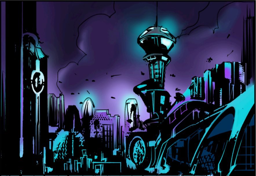
Another minor highlight to the issue is Grande’s linework and Salinas’s coloring in Thornton Township—specifically in the panel with the city landscape. The thick black lines and dark purples and blues work here, not only because it’s supposed to be nighttime but they give a sense of chaos breeding in the city. (However, I didn’t quite understand why Esme needed to strip out of her normal attire and into a skimpy tank top and tight-fitted pants. She clearly is there for a job and doesn’t need to blend in.)
The Escort has potential, but it needs some work. Maybe this was just a rocky start and over the next few issues the story will pick up and the art will get better. Project-Nerd Publishing is an independent company that’s new to the game, and I do hope its comics can make their way into local stores. But if Project-Nerd wants to be noticed, it needs to step up its game.