

 I Hate Fairyland #18
Image Comics
Writer: Skottie Young
Artist: Skottie Young
Colorist: Jean-Francois Beaulieu
Letterer: Nate Piekos of Blambot
Release date: 4/4/2018
The end is coming to I Hate Fairyland and it comes in the form of a dark and stormy cloud that is engulfing all of the lands. I always enjoy how there have been multiple points to lead the reader where things may seem to end and this time we’re seeing a literal take on bringing the end to it all. I would also have to say that this is probably one of the least violent issues in the run so far. Outside of seeing a village turned into rubble in the beginning, we don’t see any dismemberment of body parts or impalements of some sorts. Even though these aren’t the main reasons to read the book, they definitely give a lot of good laughs for how over the top and grotesque they can be. This is mainly due to the absence of Gertrude as she is presumed dead right now. Now she is needed, as Larry and Duncan believe she is the only one that can save everyone.
Early on in the series, we would get these fun little narrations from Larry on the current state of his and Gertrude’s adventure and it has kind of been absent lately. The way it’s brought back is quite funny and the remarks Larry makes on trying to write makes me wonder if some of it has to do with similar feelings Skottie Young had felt when he began his writing. Duncan is still with us and he points out the biggest elephant in the room about the world that we’re in. The sheer fact of how they do their business and essentially put up a front of how things really are by making all the children believe that Fairyland is just a magical place where all is well.
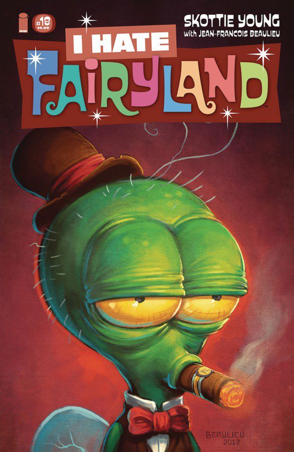
The art from Skottie and Jean-Francois is still one of the best things to see when you read this series. The bright colors and goofy looking characters that range from cute to monstrous help give the world the picture of looking bright with a dark layer beneath it. The super cartoony style helps make it feel like a fantasy world and the way expressions are drawn with exaggeration to emphasize happiness and anger makes it look like the characters are moving. The issue is more of a setup for the next but still manages to offer what keeps people looking forward to each issue. If this series is new to you, I highly recommend starting from the beginning and catch up to how The End will be handled.