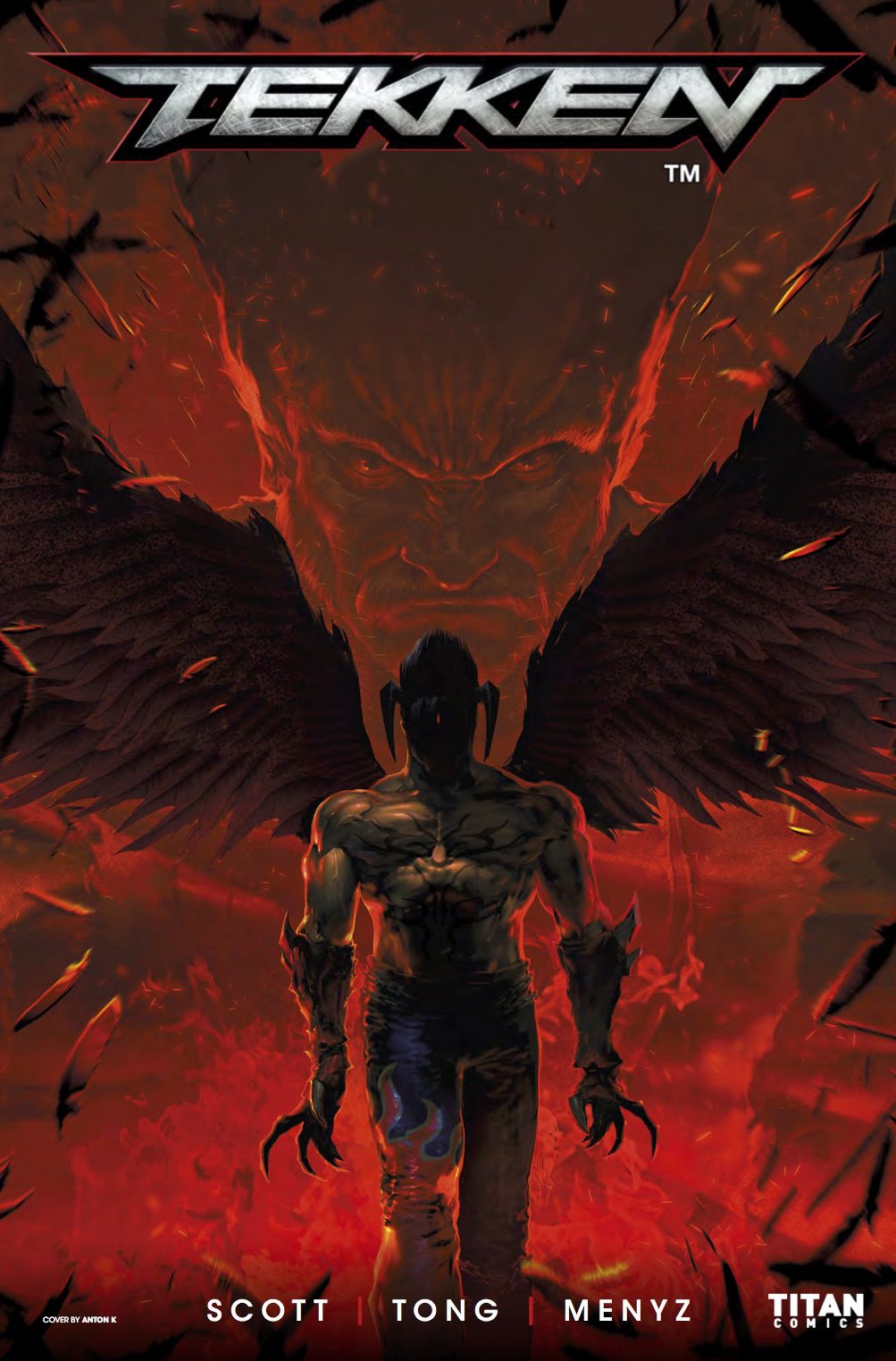
Tekken #1
Titan Comics
Written by: Chris King
Art by: Jesus Hervas
Color by: Jason Wordie
I wasn’t introduced to the Tekken franchise until I was nearly out of high school. At that time, I was getting accustomed to a new set of friends, and they were all fighting game fanatics. My only interaction with fighting games was Smash Bros Melee, and even that wasn’t properly considered a legit fighting game until a few years ago. But these guys were serious about their fighting games, one, in particular, being Tekken Tag Tournament. I won’t go heavy into juicy details but that game led me down the path of 3D fighters. Eventually, I got into other Namco classics like Soul Calibur, but my fondest memories of Tekken were in Tekken 4.
Tekken 4 was important for me because it established that fighting games could have a fun, engaging storyline. It was also important because it brought back Kazuma, a character long thought dead. Even more importantly, it introduced Steve, Tekken’s first boxer. I love boxers. Along with other cool features, Tekken brought a refreshing life for fighting games that even a relative newcomer like myself to immediately appreciate. So when I read Titan Comics were publishing a comic based on the new game, Tekken 7, I couldn’t wait to review it.
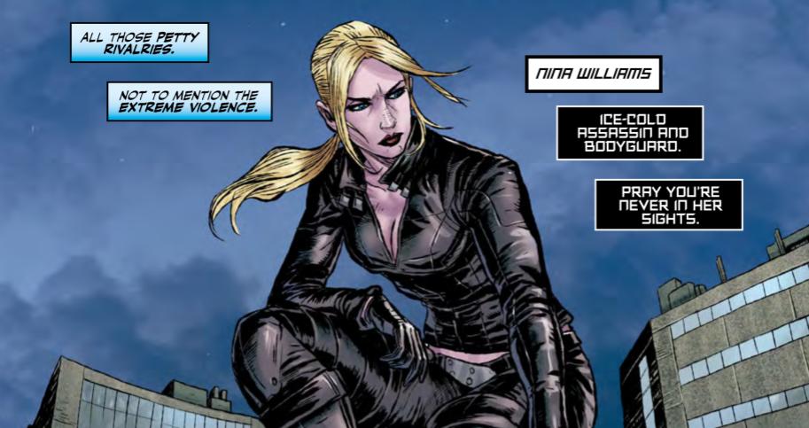
For starters, the line art is clean and lends a sense of depth in certain panels. There’s one thing about fighting games and a fighter’s sense of style. Sometimes, they can come off as too simple. Other times, outfits are flamboyant as hell. Tekken always seemed to strike a sensible balance with its roster. So in the realm of comics, using in-game outfits keeps many characters from looking overly out of place. Except for Anna and her silk dresses, take care of your wardrobe girl.
In some panels that zero in on facial expressions, the art is less flattering. Xiaoyu for instance, a character of Chinese descent, but doesn’t look remotely Asian for the duration of the issue. I won’t pretend to know the reasons her eyes weren’t drawn to represent her nationality. This wasn’t something I was actively looking to find. First, I noticed Xaioyu didn’t look Asian in one panel, and 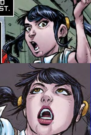 then again in another. By the end of the issues, I wasn’t convinced that Xiaoyu ever looked Chinese. If it was a couple of panels, I might not have even mentioned it, but all I kept seeing was a wide-eyed girl instead of a Chinese girl.
The questionable facial emotes didn’t help either. And it’s not like the art is bad; it’s really not. It’s simply not representative of one character. In other sequences, the panels are stylized to complement the fight scenes, the action is done nicely, and aside from my one gripe, the art is pleasing. Hell, I would think drawing those weird tentacles on Yoshimitsu’s head, or even Yoshi himself, would have been a task much harder than drawing an eye shape, But I’ll drop the mic on that one.
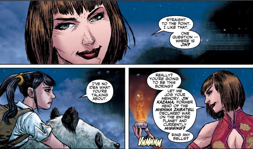
As an amateur writer, it can be a daunting task to create a multitude of different characters from scratch, each with their own intrinsic values and faults. The dialog then becomes another matter entirely. You have to think of accents, dialects, education; all things that would impact how a person chooses to speak in daily life. And I’m only scratching the surface to give examples. Here, the dialog is as black and white as bad gets. If this were early 90’s Arnold Schwarzenegger in Commando, the dialog would be fine. It would even be entertaining. But, I like my dialog original and with a sense of sophistication. More importantly, dialog needs to represent the characters, not just in dialog, but in their image too. We don’t get that here. What we get is rushed and lazy; the deadliest combination.
With Tekken 7 right around the corner, the comic doesn’t give readers a sense of priority at all. And that feels odd to say because it’s still a fun comic to read. But those first few pages are jarring. Take a look at the panel below. I honestly can’t even tell if it’s self-aware of its bad dialog, or if it’s just bad on its own. My gut says the latter.
Bottomline, if you’re an especially avid fan of the Tekken franchise, I’d advise to get yourself a copy. This is only part 1 of 4, just long enough to satiate your thirst for the game, which comes stateside June 2nd. The first issue also comes in 6 different cover variants, making them a solid collector’s catch. I’m leaning towards the Kazuya/Heihachi cover myself. The art is fantastic despite some hiccups, but the dialog tanks some of the comic’s worth. The issue does end on a high note, so I’ll leave some hope on the assumption that the cliffhanger pays off next issue. Unless you’re a fan of the franchise, ask your comic guy for a sampling before you decide to buy.