

 American Gods #2
Dark Horse Comics
Story: Neil Gaiman
Script/Layouts: P. Craig Russell
Artist: Scott Hampton
Letters: Rick Parker
American Gods was the first thing I read from Neil Gaiman after falling in love with his comic series, The Sandman. It’s similar in a sense that it toys around with mythology, but the American Gods novel felt more intimate than the Sandman series. I’m excited to see it adapted into a comic book and television show.
This issue does a good job of portraying just how frustratingly mysterious Mr. Wednesday is when he’s introduced to us. Shadow had just been released from prison and discovered his wife had died, yet there is Wednesday with all the answers. I can already tell that this adaption will be a little closer to my imagination than the TV series. Wednesday still has that Hank Scorpio from The Simpsons vibe from the novel that I always pictured in my mind.
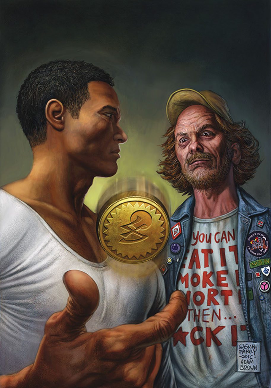
The Mad Sweeney scene is one of my favorites because it gives you a feel at just how chaotic the story will get. As you follow Shadow at the start of his journey, you don’t quite know why something is happening and who you should trust. Mad Sweeney identifies himself as a leprechaun, while Mr. Wednesday never really cares to explain who he is, and Shadow just rolls with it. This version does a good job of giving you that feeling of not having your bearings yet.
Laura’s funeral gives you the best idea of where Shadow’s head is at. Both him and his best friend’s wife, Audrey, were being cheated on but both had different reactions. The confrontation between Shadow and Audrey over her spitting on Laura’s dead body wasn’t as uncomfortable as the novel, but it gets close. I’m very happy with the way P. Craig Russell is adapting this story. I was worried a lot of the nuances that you read in the novel would be lost in translation but that’s not the case.
Unlike the story, the art has fallen flat for me. The story is hitting all the beats it needs to, which doesn’t give the art much to do; and at times it feels redundant. The art isn’t telling part of the story like it would another comic book, it just serves to compliment the words you just read. Which is a shame because the art style itself is actually excellent. This comic was never going to be exactly like what I saw in my head, so going with a more stylistic approach made sense. It’s hard to complain about this because the alternative is backing off with the story and hoping the art could convey the missing text. Maybe it’s just me, but I’m not getting much out of the art. It looks beautiful if nothing else.