

What would Gotham look like if there was an imposter Batman killing criminals instead of apprehending them? Has Batman finally broken his vow not to kill, or is it someone else? We focus on Detective Wong, Leslie Tompkins, and Bruce Wayne to discover who this imposter truly is and their motives.
DC Comics
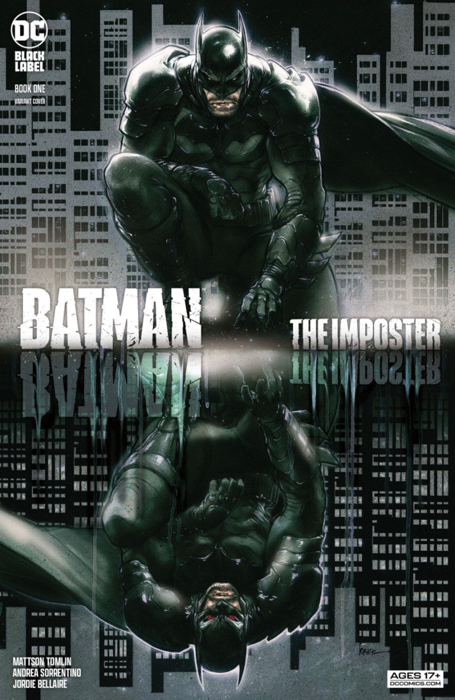
Words by Mattson Tomlin
Art by Andrea Sorrentino
Color by Jordie Bellaire
With Batman being established for a few years now, his actions were mostly towards protecting the citizens of Gotham. With the top 1% of the corrupted Gothamites looking to cash in, a string of high-level crimes starts rising. Insurance scams, crimes against rivals mob bosses, and hits on enemies are being attributed to Batman. When someone who looks like Batman executes three criminals, the shift now becomes to stop this Batman at all costs.
The overall impression of the story is underwhelming. Heralded as the darkest Batman story, Tomlin doesn’t nail it. It is a challenging feat to accomplish with Batman, who has a history of the darkest comic stories. It doesn’t touch upon anything new and feels more of a retelling of Under the Red Hood than an original story.
The art isn’t much better with the darkest theme tagline. Many of the pages feel cluttered and confusing. Using dark muted tones doesn’t add or subtract from the story overall. Some of Sorrentino’s panels are an outstanding balance of characters and backgrounds. In contrast, other pages feel clustered with the massive amount of words and the layouts keeping things stationary.
Batman The Imposter is the product of lousy marketing and placement in an overcrowded Batman landscape. The story is similar to other Batman titles and doesn’t feel like it belongs under the Black Label series as Batman Damned did. This mislabeling did more harm as the hype isn’t justified.
Final Thoughts on Imposter
Overall, the issue misses the marks the marketing set up for it. Tomlin’s story isn’t well constructed and lacks cohesion with all the themes. Sorrentino’s art lacks consistency for each page, which is evident when a statue is prominently jammed as part of the background, with mostly dialog moving the story. Unfortunately, this issue tried to remake the wheel, and it ended up as a square instead.