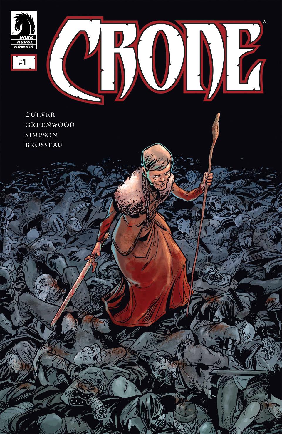
 Crone #1
Publisher: Dark Horse
Story: Dennis Culver
Art: Justin Greenwood
Colors: Brad Simpson
Letters: Pat Brosseau
This title does not release to the public until Nov. 6th. This review contains spoilers. If you don’t want the book spoiled then please DO NOT proceed further.
There once was a mighty warrior princess, BLOODY BLISS, who was as feared as her fabled blade, Mordenstorm. This fiery-haired beauty leads an army against the warlord D’ Kayde. With her trusty companions, Vor the Lion’s Roar and Gaspar Rogue the mighty trio overcame incredible odds and saved the land.
That was many years ago. Now Bliss lives as a hermit on a lonely mountain top, awaiting death to take her away from a warrior’s life that has no enemies left to fight… or so she thinks. That all changes as she saves two travelers from a bear attack on the mountain; one of those souls is Bliss’ dear friend Gaspar, who is now a father and has sought out the help of a once-mighty warrior to face a for that they had killed many moons ago.
Culver doesn’t waste any time in immersing the reader into a world that is all too familiar when it comes to fantasy. The parallels between the characters and the source material that these creations are loosely based on are apparent at first glance. Bliss is a proxy for Red Sonja, D’Kayde is designed after Sauron from Lord of the Rings, Vor is Conan and Gaspar is the stereotypical rogue; perhaps based off of Bruce Campbell’s character Autolycus, the King of Thieves from TV’s Xena and Hercules.
The point is that Culver has all the tropes and staples of the fantasy genre working overtime in this first issue. Even as the story moves forward to present day Bliss is playing up the trope of the tired old warrior tempting death because life holds no more challenges. We even get the “But I made a promise I wouldn’t fight” speech from Bliss when Gaspar tries to convince her to take up the sword once more.
Even as the characters are trying to draw off of the reader’s familiarity Culver hides thinly-veiled nuisances throughout the story. D’ Kayde sounds like a decade or maybe decayed…either fits in with the theme of Bliss battling her own old age, now frail and unsure of herself; she is fighting the hands of time… or the decades…get it? Do you see what they did there?
While I understand that the writer is pressed for space to introduce the characters and plot in such a short span of one issue, Culver maximizes his time by moving the plot along, not wasting a panel. The story is assisted at times by the old familiar tropes that they lean on. We assume Gaspar is a charming rogue with a heart of gold because that’s what has been presented to us as an audience time and again.
My opinion towards the writing of this book sways from loving the set-up to being annoyed at the writer’s use of shortcuts and shorthand for the genre. While there is a tight story being told in this issue, it feels as old and worn down as Bliss herself.
The real breath of fresh air to the festivities is the artwork by Justin Greenwood. (Stumptown) Greenwood’s style falls somewhere between Ed McGuinness and early Joelle Jones. The panel layouts are strong and the action keeps the book driving forward with every page; the book doesn’t drag or turn stale with “talking heads”.
There are a couple of gripes I have with the art in places, lack of backgrounds, and some poses that could have been adjusted, but these details are minor.
The rest of the art team falls in the same category of hit and miss. The colors of the book start off bright and vibrant in the flashbacks of Bliss’ glory days. These pages pop and stand out, but as we transition to current events the color washes out… which at certain points makes sense… the snow-swept mountains should be pale and muted, but there were pages later on that could have benefited from a dash of color. There is also a reveal at the end of the comic that was mired down by the use of muted colors that took some of the punch out of the page.
The inks in this were sloppy. The start of the book seemed more streamlined and by the end, line-thickness and neatness appeared rushed. I don’t know if this was deadline related or if Greenwood or Simpson fell behind. (Not sure who handled the inking chores)
The lettering was handled deftly. The sound effects were sparse yet effective. The placement of text balloons was on point and the font was easily readable. This part of the book was flawless.
All in all, Crone sets the stage for what might be a grand adventure or maybe just a rehash of a D&D style story that we have seen too many times before; really it’s too early to tell. The book could go either way. Judging from this initial offering there is more than enough here for readers to enjoy. I say take a chance and see where this creative team leads you. If nothing else, this might be the “what if” Red Sonja tale that no one has told yet.

