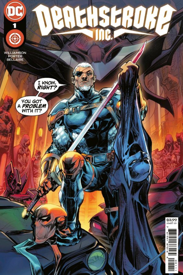
Deathstroke Inc. #1
DC Comics
It’s been too long since readers had an ongoing Deathstroke title. Although, it was probably best to provide some space between Christopher Priest’s awesome run and Deathstroke Inc. The series-opening issue indicates there are definitely differences between the two titles. But, Deathstroke Inc. is not at all removing itself from Priest’s run. Quite the opposite actually.
Written by: Joshua Williamson
Art by: Howard Porter
Colors by: Hi-Fi
Letters by: Steve Wands
Deathstroke goes so far as to address his past, both recent and distant, acknowledging he has to make a decision. It appears he fully expects his time with Black Canary will impact what direction he ultimately goes in. And this reassessment is not coming out of nowhere — something is forcing Deathstroke to figure out what path he wants to take. Just the fact Deathstroke is spending so much time on this subject seems telling.
Where Deathstroke Inc. #1 feels much different from Slade Wilson’s last series is the art. Howard Porter’s style has an edge to it, but it also doesn’t feel like he’s trying to be serious with Slade. While Hi-Fi’s colors play a role in that, nothing played a greater part in keeping things loose than Deathstroke and Black Canary’s introduction. Both did a great job of setting the tone for Deathstroke Inc. #1, and the series with it.
Deathstroke has some serious issues to sort out, but Williamson, Porter and company are going to have a fun time on this journey with Slade and Black Canary.
Score: 8.5
Looking for more comic book content? Go check out the latest episode of Geeks WorldWide Radio‘s TLDR podcast, where Joseph Gilmore and Nick Friar discuss comics weekly and talk to creators from the industry — available on SoundCloud, Apple Podcasts and Spotify!


