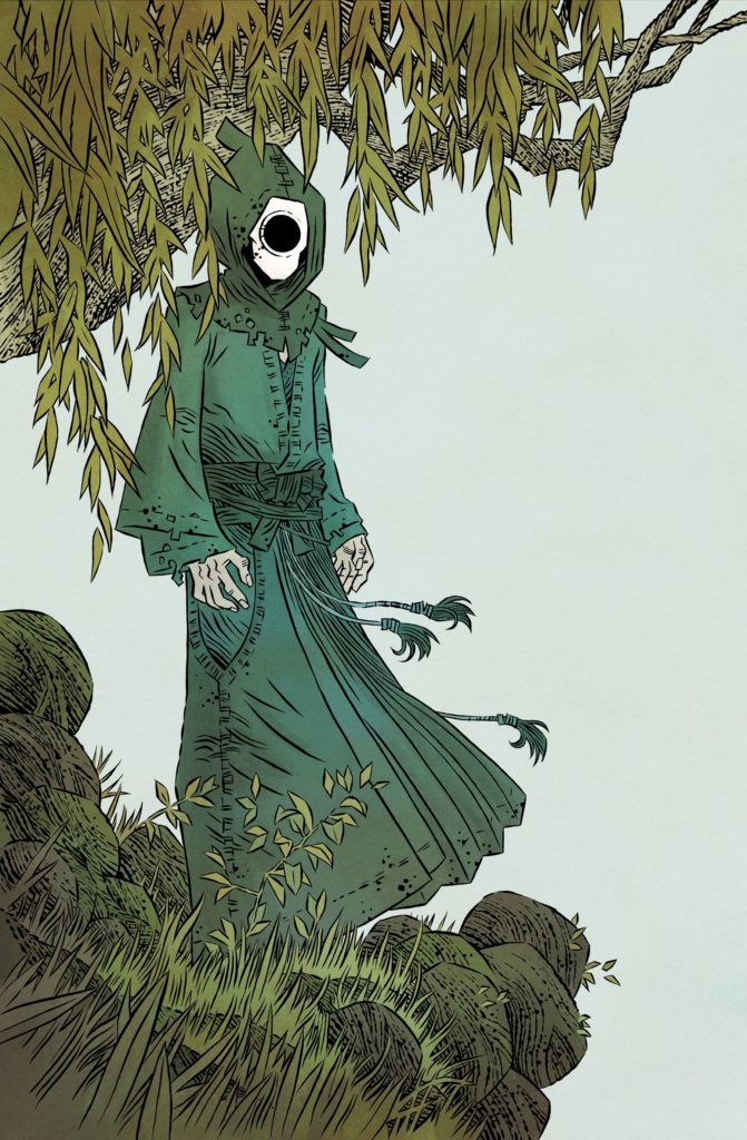
Ghost Tree #1
IDW Publishing
Written by: Bobby Curnow
Art by: Simon Gane
Colors by: Ian Herring with Becka Kinzie
Letters by: Chris Mowry
Consultant: Takuma Okada
A beautiful and haunting descent into a Japanese ghost story that promises to be full of folklore, family, and frustrations, this opening issue gives us characters we are immediately curious about. There are unanswered questions from jump, and the first page sets up a supernatural mystery that turns on its head on the last page.
This issue introduces Brandt, who returns to Japan after many years away and explores the woods around his Grandparents’ house. He stumbles upon the Ghost Tree, a supernatural haunt where generations of Brandt’s family have stayed despite being dead. Even though his (now-dead, and very much ghostly) grandfather warns him about the nature of this he states that this is where he belongs – despite his wife back in the States.
I feel like I can empathize with these characters, even with the limited information we have. The family dynamic is relatable and understated and allows for a lot of complexity in only a few interactions. I think that this is the start of a story that will easily cross cultures, all the while staying true to the inherently Japanese story base and structure. The fact that Takuda Okada – a talented game designer and writer – is on the team makes me confident that this story will be told authentically and respectfully.
The art is lovely, reminiscent of Tillie Walden’s On A Sunbeam and the early issues of Usagi Yojimbo. Simon Gane’s style comes through as a perfect, loose accompaniment to the story, and the plot allows for a soft, easy pace with panels that showcases Gane’s talent. The lineart does have a brush-like quality that is exceptionally suited for a Japanese tale, and the crisp, clear colors in a muted palette speak to a restraint that might be broken later in the series.
I particularly like the structure of this issue. The panels are neat and direct, without much variation from squares and rectangles. I think that this choice, in particular, is well-suited for the story. It is a story of constraint, pressures, and expectations, and I look forward to seeing if this carries through the next issues, and what causes it to break.

