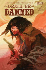
Death Be Damned #1
BOOM! Studios
Written by: Ben Acker, Ben Blacker and Andrew Miller
Illustrated by: Hannah Christenson
Colors by: Juan Useche
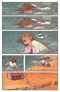
A group of bandits rides through the plains as a woman, left for dead, emerges to find everyone she loves has been murdered. As she saddles up the last living horse on her property and arms herself for revenge, a man named Gattis takes his deceased brother to the local mortician, but when he’s left alone with the body, something unexpected and disturbing happens. Eventually the young woman makes her way to town looking for information on the men who killed her family. As she gets closer to one of the men involved, the encounter does not end well for her.
As she swirls between life and death, she is saved by the Native American mortician in a ritual that the both of them can’t believe actually worked. The woman is skeptical, angry and bent on the revenge that she continues to be denied while the mortician tries to explain to her the miracle that she’s endured. The two of them come to a final confrontation that seems to serve as the dynamic of their relationship and if the epilogue of this issue is any indication, that relationship is going to get a lot more complicated.
Ben Acker, Ben Blacker and Andrew Miller have crafted a classic western revenge story. The back drop and the dialogue are dripping with tropes of the genre that are effective for a reason. The relationship dynamics with the people in the town can be a little clichéd as you want a sense of place in this town, but that might be the point. With the exception of a couple of minor characters, no one in the story has been introduced by name. There is no indication of who these characters are and the lack of personal connection could, hopefully, lead to something interesting in the narrative.
The artwork by Hannah Christenson does the same thing as the narrative. There is a lack of fine details which make the art pop as you follow the panels. The detail is reserved for the protagonist and her purpose, so the backgrounds and the background characters tend to blend into each other, narrowing one’s focus. This is a really good use of minimalism that serves the story without taking the reader out of it. The epilogue of the first issue opens up some interesting doors. Hopefully, the creative team will take us on a satisfactory journey through them.


