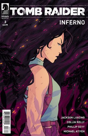
 Tomb Raider: Inferno #3
Dark Horse
Writer: Jackson Lanzing, Collin Kelly
Artist: Phillip Sevy
Colorist: Hannah Templer
Cover Artist: Michael Atiyeh
I don’t have the nostalgic ties to Tomb Raider that many fans do, but I’ve played the games in my time, watched the movies, and even sat down for the newest Alicia Vikander adaptation. I’ve been following this run hoping to see more of what I love about Tomb Raider: a badass woman who takes no shit, can fight her way out of problems, and outthink traps and schemes.
This run so far has failed to deliver. The tomb this time- a lost Eden trapped in the north pole – is unique and at the very least makes it harder for us to overly sexualize a character that has been mistreated in the past. However, the action is slow, if nearly non-existent, so far Lara has been captured and rescued almost completely without any agency on her part, and she continues to be haunted by her past.
The great thing about a lot of the Tomb Raider stories is that at the core of every rumor or legend there is something mystic, spiritual, or haunted about the place. I haven’t seen that yet with this run, and I have no real hints about what it could be. I want the weird mystic nonsense. I love that nonsense. All I have now is Enochian symbols and hints of a magic trinity, but I need more to keep me invested. Right now, all I really want is for Lara to have some great action scenes.
I was hoping that with a new run we’d get a new Lara. The comic seems intent on delving into the backstory of the character, and instead of giving us something fresh and fun, we are bogged down in old psychological traumas, daddy issues, and references to past stories that lose a casual reader. This comic is inaccessibility at its finest. The use of metaphors, strange visuals, and art that is so focused on interpretation rather than demonstration makes this small issue confusing and frustrating to read.
I was drawn in by the gorgeous cover art of Tomb Raider 1, and was disappointed but not totally put off by the art throughout the series. I would have loved a brighter, more vibrant, more life-filled Lara Croft, but this issue, and this series, continually shows Lara as a hollow shell for her past. I don’t want to have to read 30 issues to understand one. Especially for a new run, I should be able to get into the story and care about Lara for what she brings to the page immediately. That doesn’t happen at all in this issue.
I don’t have much hope for the rest of the run, but hopefully, they can pull it together and write a great story for Lara, despite this mediocre and heartless start.

