Thanks to fortyseven communications for providing GWW with the review build used in this editorial.
Back in September of 2012, Torchlight II was released on PC. It’s a game that I hardly played, despite my love for ARPGs (aka: Diablo-likes). My 15 hours with Torchlight II were well enjoyed but didn’t knock me off the Diablo 3 grind. What publisher Perfect World have accomplished this September with the release of Torchlight II on Switch, addresses everything I didn’t know I was missing 7 years ago.

The First Thing – Mobility
Mobility is a cornerstone of the value inherent to the Switch. Yet not every Switch title can claim to be mobile-friendly. With the new Switch Lite, this takes on a whole new meaning. Diablo 3 is a similar game and it’s not quite as mobile friendly. The text is small and overall textures are grainy. The same can be said about Resident Evil 4. It’s a wonderful game, of course, but it’s challenging to play on a small screen with Joycons – it’s better suited for a Pro Controller.
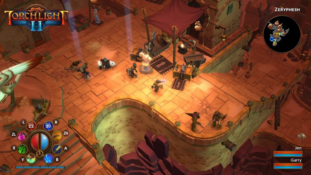
Develop Panic Button implemented a buttery smooth zoom function in Torchlight II. This in conjunction with a wonderful inventory system enable gamers to enjoy a mobile experience. To zoom, you simply push and pull the right analog stick, which is easy to do on the affixed Joycons. You can even do it while in combat if you want to focus on the combat. My main build is a ranged character class called an Outlander. If I’m struggling to aim on a boss (action is too fast-paced on standard low-HP enemies) I simply zoom in and my challenge has been overcome. You can counter this by suggesting it’s a design issue to even need the zoom function. But recall this is more than a port of a beloved PC game. This is a re-release, so there should be some level of UI re-engineering without compromising the heart and soul of the game, which combat fundamentally contributes to.

The Second Thing – Inventory Interface
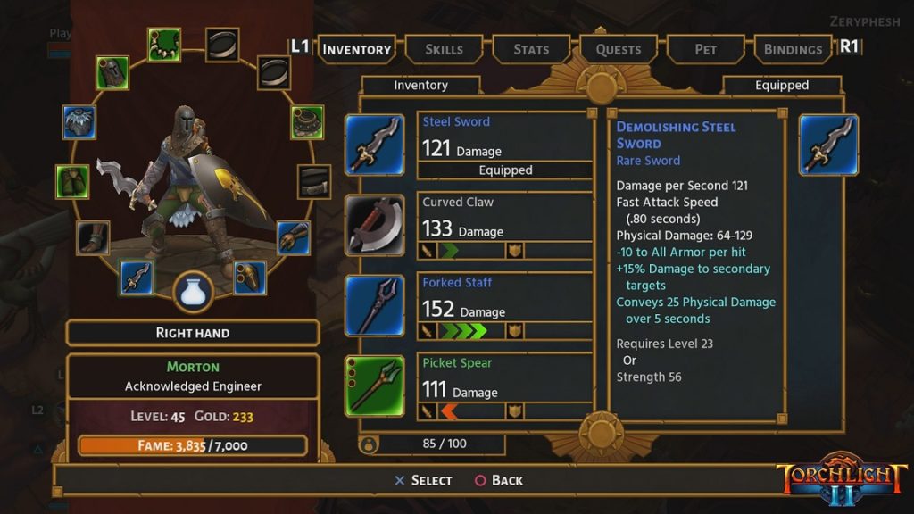
ARPGs have been a key reason to game on PC for two critical reasons: input (keyboard and mouse) and inventory navigation. Think about other console-first ARPGs you’ve played: Shadow of Mordor, Witcher 3, Tomb Raider, and so on. Their inventories occupy the entire screen and pause the game so you can carefully navigate the inventory using nearly every button on the controller. Something the Diablo 3 release on consoles did very well, is a quick-equip function when a new item is picked up. You’ll find iconography identifying the impact the item will have your build. Unfortunately Torchlight II doesn’t offer that function. It does, however, address the cumbersome nature of all RPG inventory interfaces with speed, simplicity, and it’s own take on iconography that quickly communicates the impact of the item on your build. For example, if you’re looking at changing a weapon you’ll find up to four arrows that are either red or green. The more green arrows, the greater the overall impact the weapon will have. In fact, Panic Button apparently have so much confidence in the inventory interface that they do not pause the game while the inventory is open. Bold!

The Third Thing – Speed
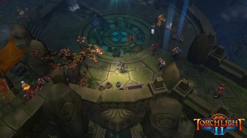
Many games on Switch suffer in handheld mode. Most games lack a smooth 30+ FPS in this mode. But not Torchlight II. It’s very enjoyable in handheld without any stuttering in my first 5 hours with the game. That’s impressive for a game that can display a ton of enemies on screen at any given moment, in fairly large environments.
Who is it For?
If you’re a fan of ARPGs you have to play Torchlight II. It’s great on PC and it’s amazing on Switch. I’m confident I’ll clock in more hours with it on Switch than I did on PC due to it’s incredible implementation on Nintendo’s handheld.

