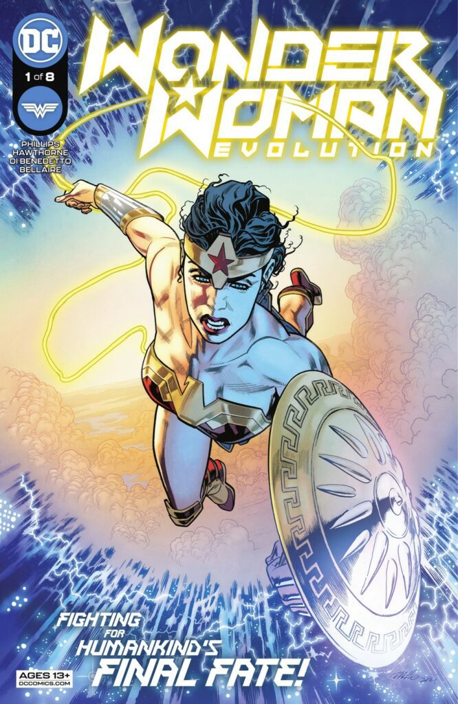
WONDER WOMAN: EVOLUTION #1
“You’re not a god, Wonder Woman… you can still fail”
The Story
Phillips magnificently sets up Diana’s trial for humanity. From the beginning, we see the villain of this issue paralleled with Diana. She makes Diana question herself. What is her purpose for being a hero? What makes her better than these villains? Does she show that she’s better through her actions, or do we only see it in her motivations? Wonder Woman is trying to steel herself throughout the entire issue, but once she meets up with a certain friend, we see her walls come down. As Diana’s walls come down, I’m excited to see if there will even be any left!
Furthermore, the overlaying narration is perfect. It feels almost thematic, seeing Wonder Woman going through these emotional challenges just as she’s taken, and hearing her impending captors discuss their motivations for taking her. It’s even more pleasing to see that she is taken to represent humanity over a certain someone. Overall, Phillips has set the perfect tone for this series and has captured Diana’s characterization beautifully.
Written by: Stephanie Phillips
Pencils by: Mike Hawthorne
Inks by: Adriano Di Benedetto
Colors by: Jordie Bellaire
Letters by: Tom Napolitano
The Art
The inks and colors pop in this series in the best way possible. Particularly, I think there is something clever to the coloring of this issue. There is a great balance between bright reds and yellows and dark shadows. Looking on the outside, it seems like Diana is her normal self. She is bright, as golden as her lasso. However, looking closely, we can see that she has multiple dark spots added to her skin. She also has a lot of shadowing around her muscles, especially on her arms. To me, this could be foreshadowing that Diana’s true test will not be on her physical strength, but on her emotional and moral strength. The darkness is in her and it is coming out. Absolutely brilliant!
Contrastingly, while Hawthorne’s pencils are magnificent, I had to adjust to some of the differences in style for this book. Every single environment looks amazing! However, Wonder Woman and other characters’ features are more rigid, more triangular. They are almost grotesque at times. This was hard for me to adapt to at first, but after I read the book, I realize this style fits the tone of the series. This art style may not be my personal preference, but it is essential to Wonder Woman’s Evolution!
Final Thoughts
I absolutely adore stories that test our greatest heroes’ limits. I love seeing characters that we believe are “perfect” find their gray areas. Wonder Woman: Evolution is no exception to that! This is the next great Wonder Woman story – you do NOT want to miss out on it! Be sure to pick it up at your LCS TODAY!

